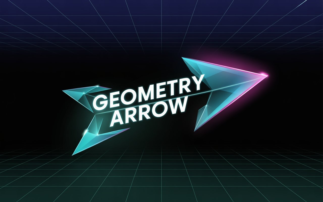
Constructed of the simplest elements, the geometry arrow integrates direction, accuracy, and significance. It sits mathematically at the convergence of design, tech, and ancient symbolism. It’s a global unifier, pointing to what lies ahead. This piece captures the essence of the geometry arrow, incorporating its design, math, user interface, digital design, and cultural significance.
1. Foundation: Lines, Angles, and Vectors
Purely, a geometry arrow is math. It starts with the basic building block of any geometry: the line. The line is the arrow’s shaft and represents a pathway or trajectory. The most recognizable aspect of the arrow is the arrowhead, which is usually a polygon of two triangles or an isosceles triangle attached to the shaft.
Every detail matters. The sharper, more acute the angles of the arrowhead, the more it portrays a sense of urgency. Sharper angles also suggest speed, while wider angles suggest stability. If we put this shape in a coordinate plane, it becomes a vector, meaning it has both a position and a value. The combination of these attributes makes the geometry arrow something more than just a shape. In physics and engineering, it becomes a representation of movement. It can also represent values in a data set, emphasize a specific part of an infographic, and more.
2. The Design Principle: Guiding the Eye with Purpose
In graphic design, UX, and wayfinding, geometric arrows become an essential part of the design. The purpose becomes visual communication, and its geometric abstraction to a shape becomes more efficient.
It becomes design clarity. It eliminates all the possibilities of misinterpretation. With a geometric arrow incorporated in a design, whether it is just a bold triangle arrow or a more sophisticated pictogram, it expresses, and means exclusively and without the need of a language, to “go in, go out, go up, or go on.”
Hierarchy and Flow: On websites and apps, arrows lead users along a desired path. The “next” button, often a geometric arrow, captures users’ focus and urges them to take action. In onboarding sequences and slideshow carousels, arrows manage the narrative flow and serve to streamline the presentation of complex information by directing users to take one step at a time.
Aesthetic Versatility: The geometry arrow may be integrated into any design language. It may be minimalist and flat, made up of simple shapes and solid colors, or isometric, creating the impression of three-dimensional depth on a screen. It may use soft, rounded elements to evoke a friendly interface or sharp, angular elements to convey a more technical, aggressive brand identity. Its design versatility is a primary factor in the geometry arrow’s enduring presence in the designer’s toolkit.
3. The Symbolic Dimension: From Ancient Art to Modern Metaphors
In addition to being a practical design tool, the geometry arrow has a story to tell. It is a powerful metaphor. Arrows indicate direction, and in the case of the geometry arrow, the metaphor can refer to destination, purpose, state of mind, or goal.
Advancement and Progress: An Arrow symbolizes immediate and future innovation. It is portrayed as an immediate and continuous stream of forward motion. That is why arrows are often incorporated into company logos to convey an innovative and dynamic approach.
Focus and Decision: At points of intersection, an Arrow demonstrates the selected/decided path. It represents focus and a firm commitment to one pathway to eliminate ambiguity. This is why, in various decision-making frameworks and flowcharts, arrows are assigned geometrical and logical positions to eliminate ambiguity.
Conflict and Protection: An arrow can also represent protection. An arrow is a weapon, so in iconic/ordinate design, an arrow symbol can represent unity and strength in a single focused direction. An arrow can also represent peace, as in the peace symbol, which features a broken arrow.
*Masculinity: An arrow can also represent the symbol of masculinity. An arrow is direct, aggressive, and can penetrate through various obstacles.
4. Digital Growth: Pixels, Actions, And More
The digital revolution also meant a reinvention of the geometry arrow. A once static arrow image is now an interactive, animated, intelligent, and even responsive component of interface design.
The Cursor: The most common design in the digital world is the cursor. As a direct digital pointing device, it transforms our intention into actions at whatever position it is on the screen. For a simple design, a cursor tells a lot. It is a crucial link in the chain that connects humanity and machines.
Micro-interactions: Considerable life is infused into today’s arrows. For example, they may bounce to indicate that you can scroll down, spin to indicate a loading screen, or change to a hand symbol to confirm that an action can be undertaken. Animated geometric arrows can provide more effective feedback and improve usability, enhancing interaction with the system.
Data Illustration: In complex data models and dynamic dashboards, arrows illustrate the interrelationships, interdependencies, and communication among elements. A network diagram, for example, uses arrows to show data transfer between nodes. In contrast, a Sankey diagram uses flowing arrows of varying widths to visualize the distribution of energy or resources. Here, geometry becomes a language for much more than data. It becomes a story.
AR and Wayfinding: An augmented reality (AR) navigation app combines real and digital worlds with a floating geometric arrow. Using AR Wayfinding apps, users engage with digital arrows that guide them to points along their routes, integrating real-world features with animated geometric shapes.
5. Creating the Modern Geometry Arrow: A Design Checklist
There is a checklist for a geometric arrow design. Here are some considerations for each:
Proportion: The balance of the arrow’s head and shaft is critical. A head that is too small is hard to see. A shaft that is too short is hard to find.
Negative Space: The zone surrounding the arrow and the areas within it define the arrow’s shape. The casement at the bottom of the arrowhead is an example of negative space that impacts the overall shape.
Color and Contrast: The color of an arrow conveys urgency to the user. An arrow may be colored red with the signal that it is an error, colored green with the signal to proceed, or colored blue to signal a hyperlink.
Context: The design must meet the needs of the space it is to occupy. An arrow designed for a road sign may not be appropriate for a small app interface.
Conclusion: The Unwavering Guide
The geometry symbol that has persisted over time and become an integral part of our everyday lives will continue to exist. The symbol in question is the arrow. The arrow’s simple design communicates directions, options, movement, and development. The arrow, along with other geometric figures, will continue to guide us. Even as our world grows more complex with new information and technology, the arrow’s geometric simplicity will provide clear guidance. The arrow has become a vital component in the world. It should come as no surprise that the arrow is used in conjunction with other geometric designs to communicate information and provide guidance.
you may also read nowitstrend.


